BRANDING, CONCEPT, LAYOUT, LOGO
Exake
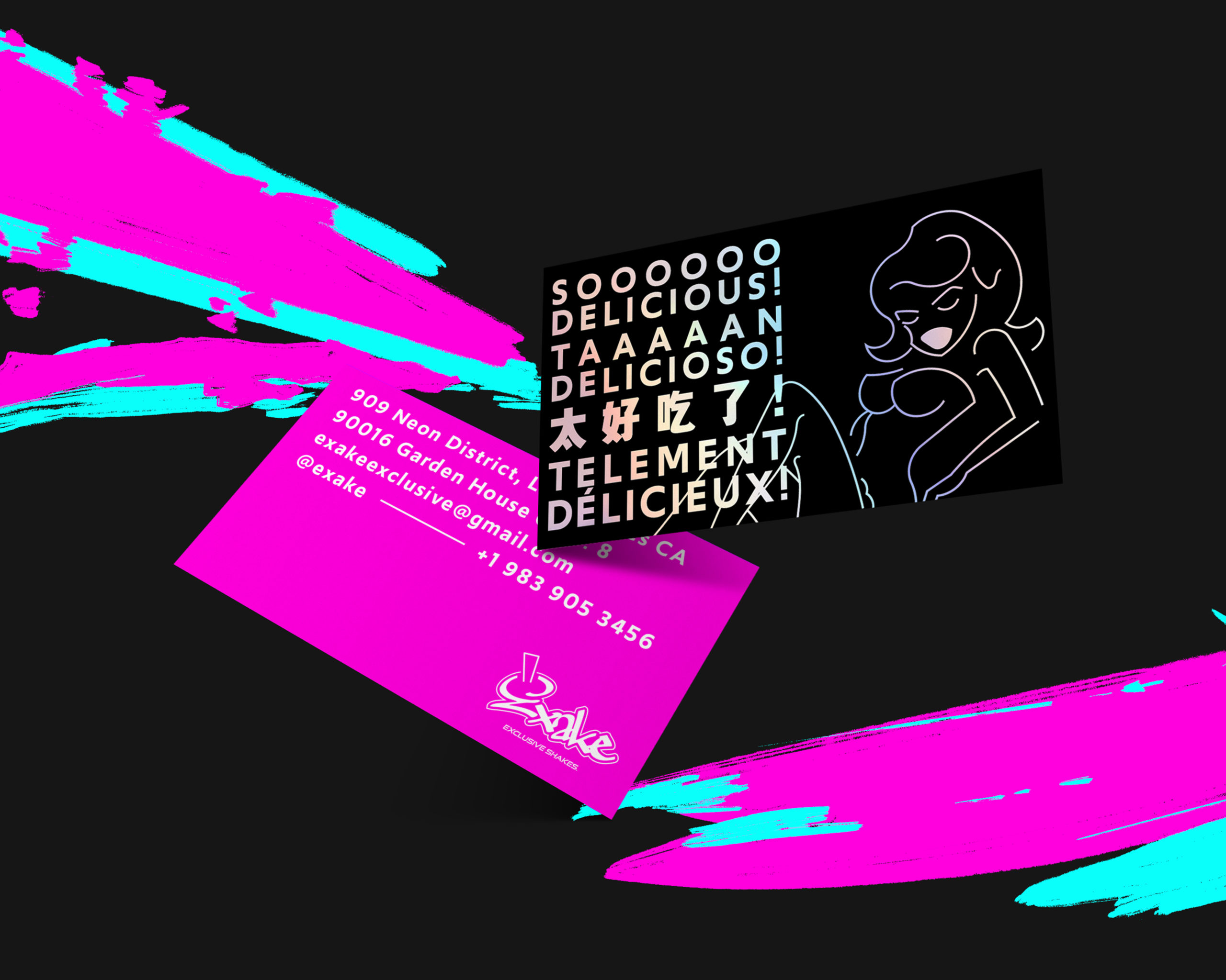
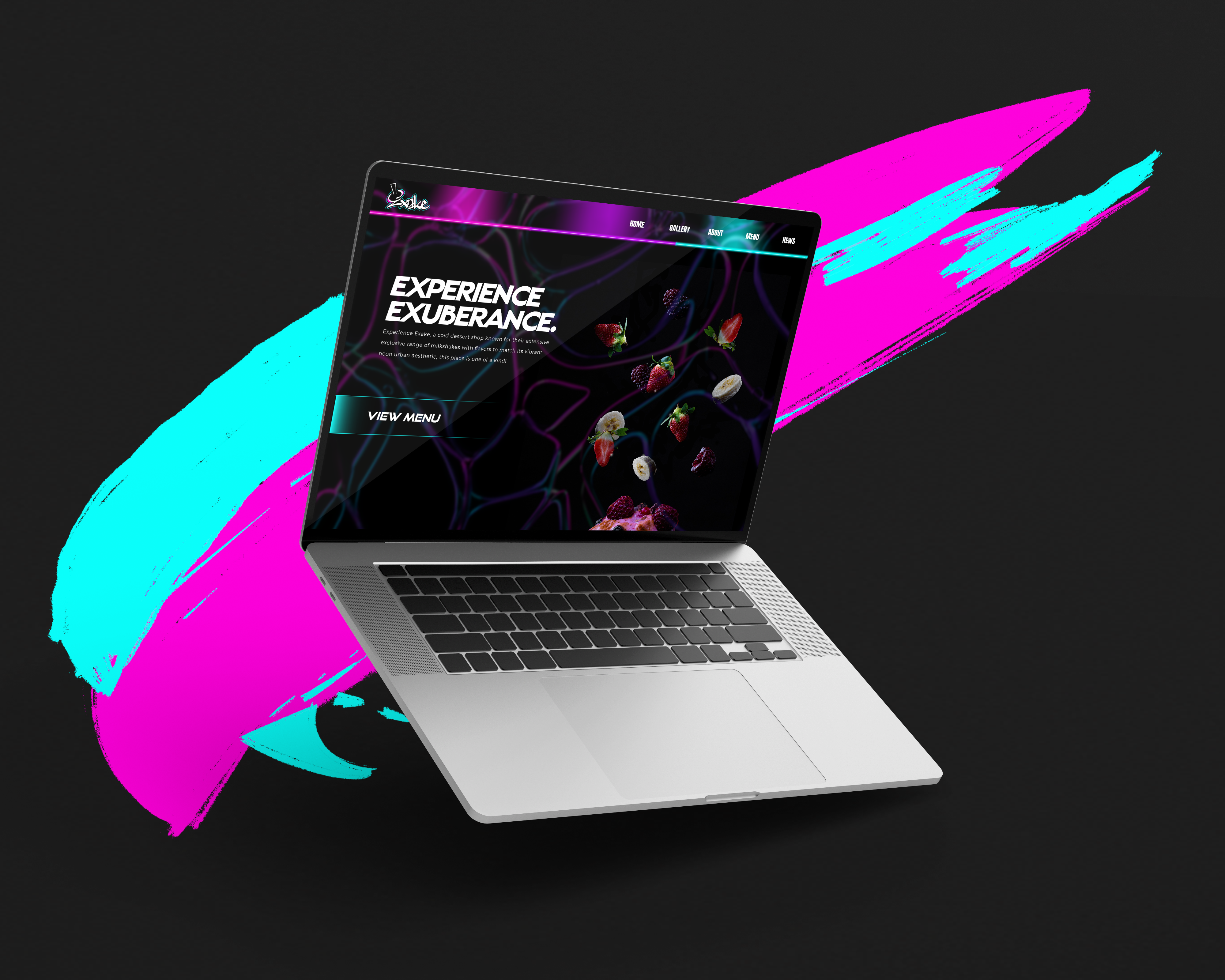
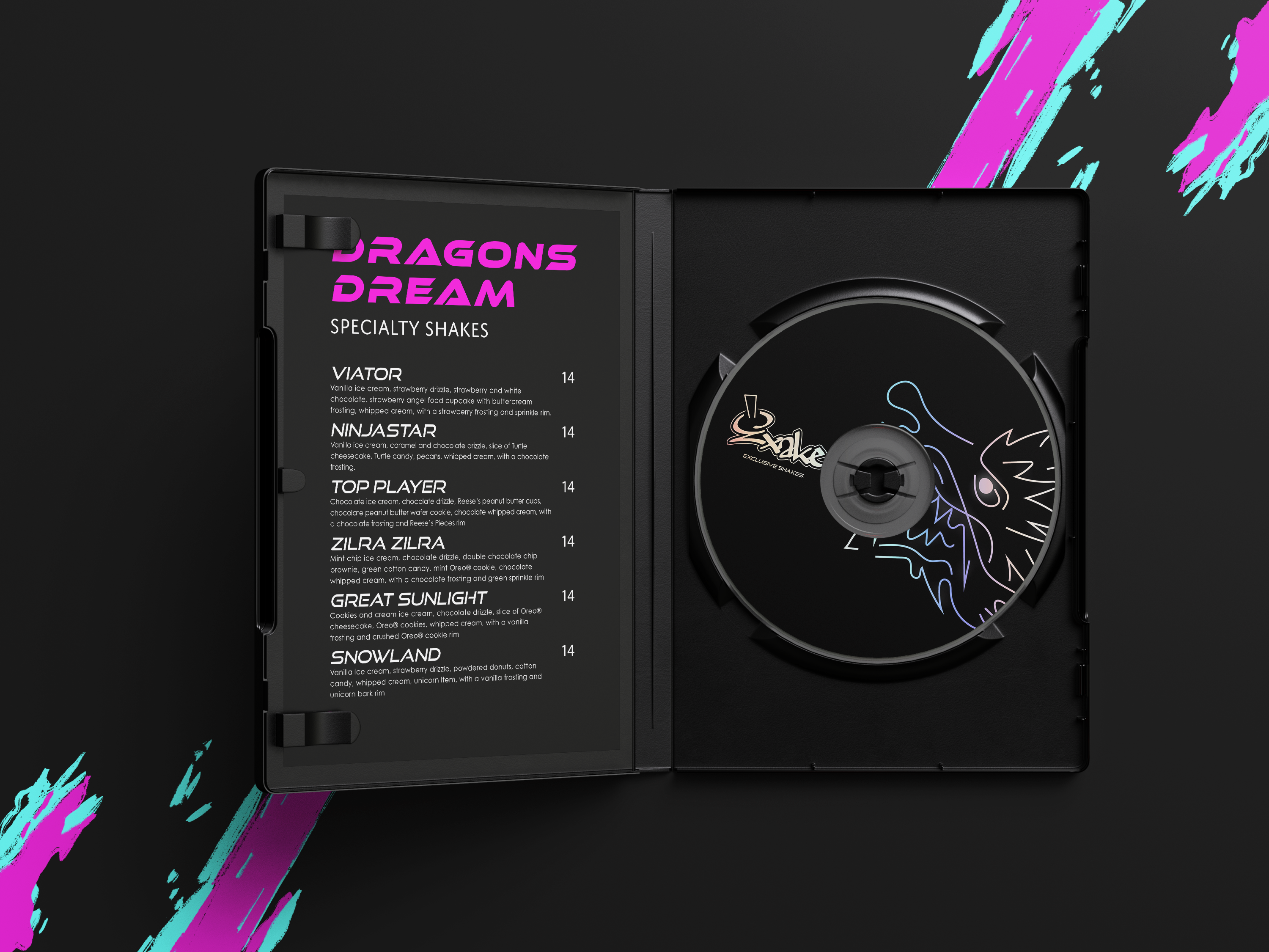
Exake is a milkshake chain based in multiple big cities across the United States. Targeting late teens and young adults, the brands visual aesthetic seeks to set iself apart from its competition.
This is accomplished by being very visually loud along with a saturated style, taking inspiration from urban settings and combining a graffiti street style with neon accents.


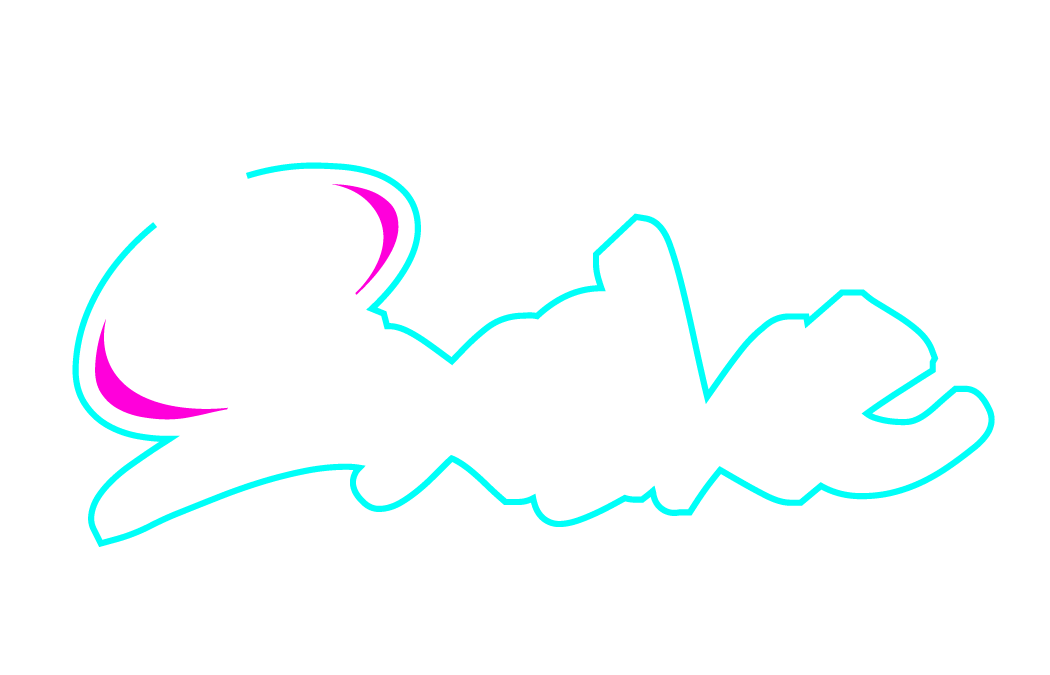
The style for Exake is a very loud and in your face one which is exactly what it needs to be. The letter ‘E’ in the logo being used to represent both a spray can and a drink cap to convey the exuberant nature of the brand as a whole.


Related Projects
SHÍCERE
CHUCKY CAMPAIGN
